
Social
Instagram layouts for your season.
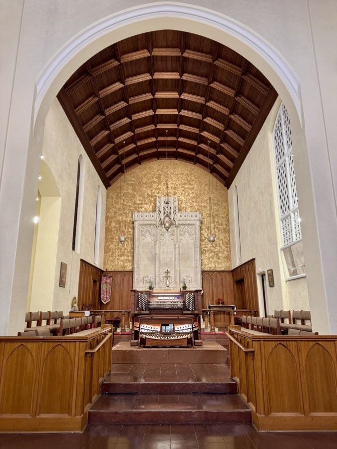
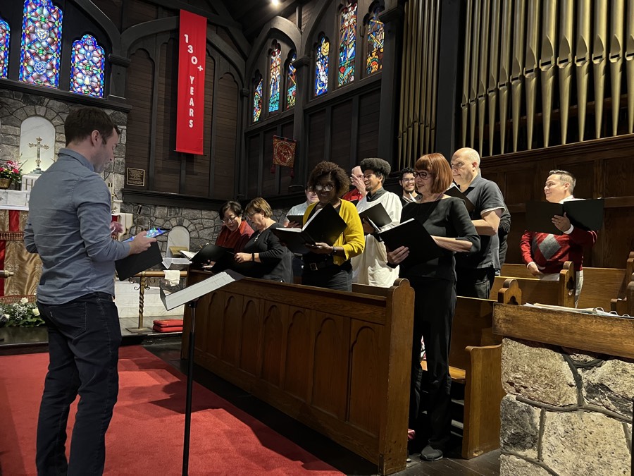
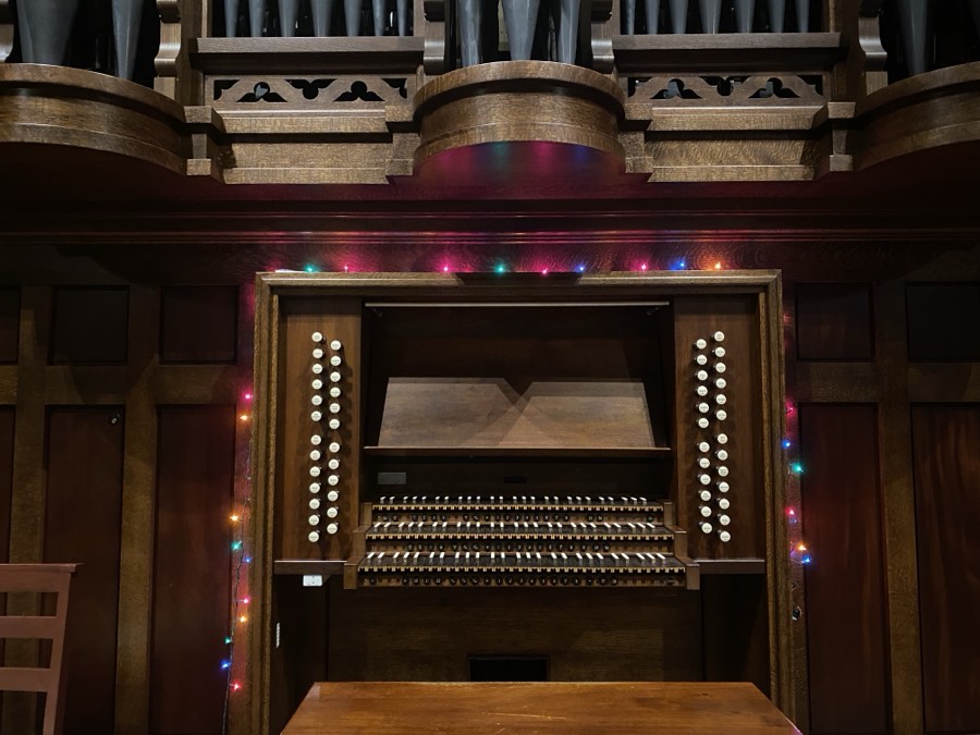
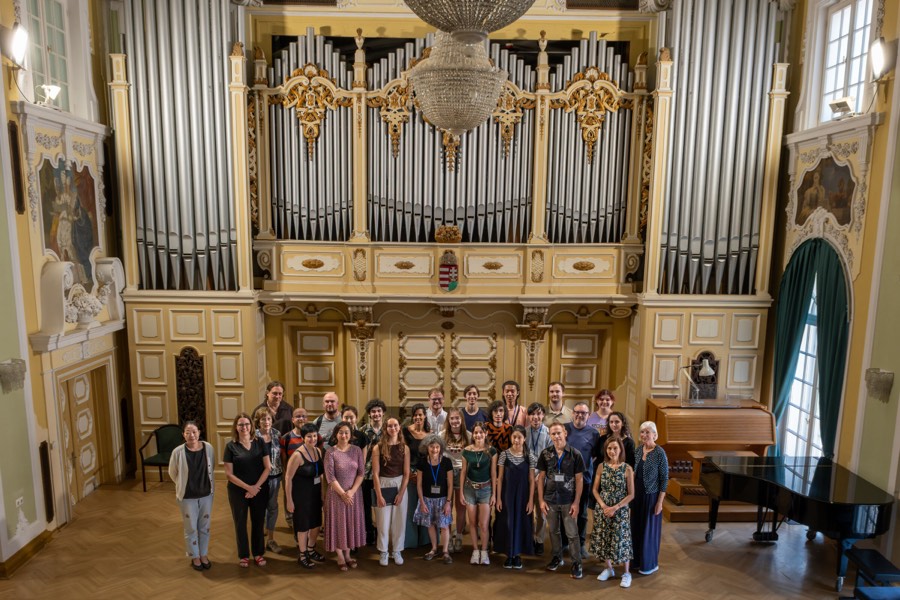
34 ways to lay out a post, each shown at the exact size Instagram uses (1080×1350). Announcements, deadlines, programmes, thank-yous. Built around real photographs of your own people and your own hall, not stock.
- Building a post
- A cover, two or three body slides, then a closing card. Seven to ten slides is the length that holds attention.
- Photographs
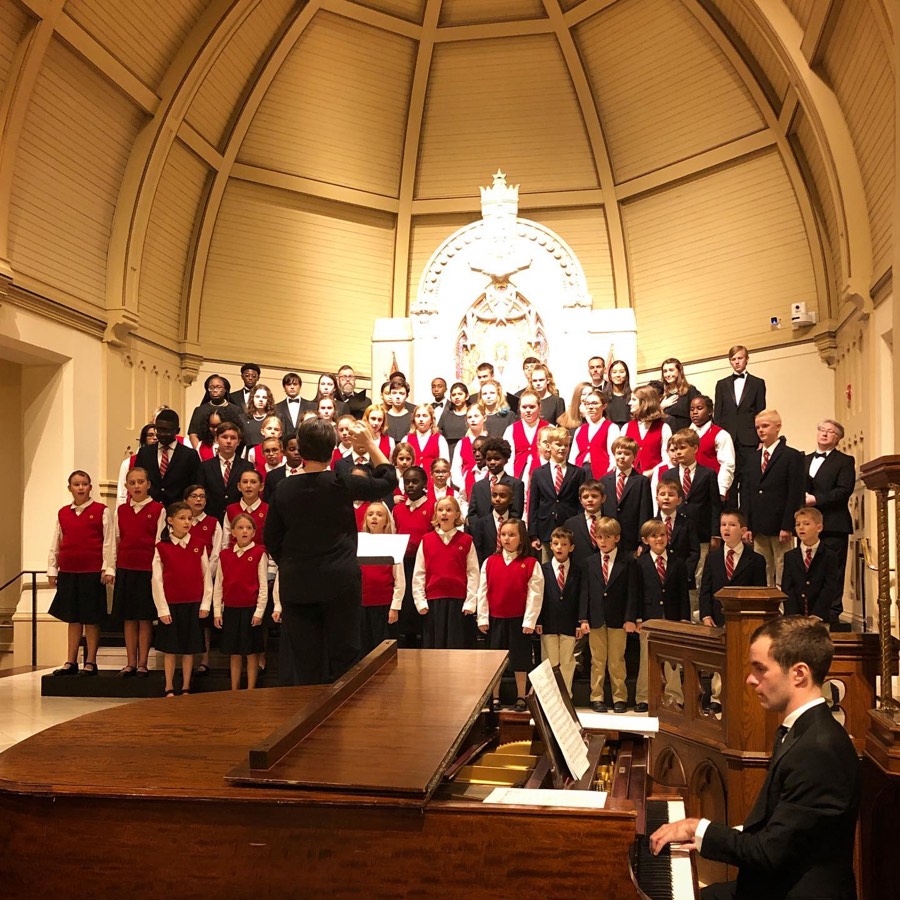
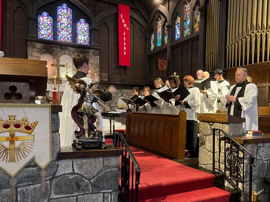
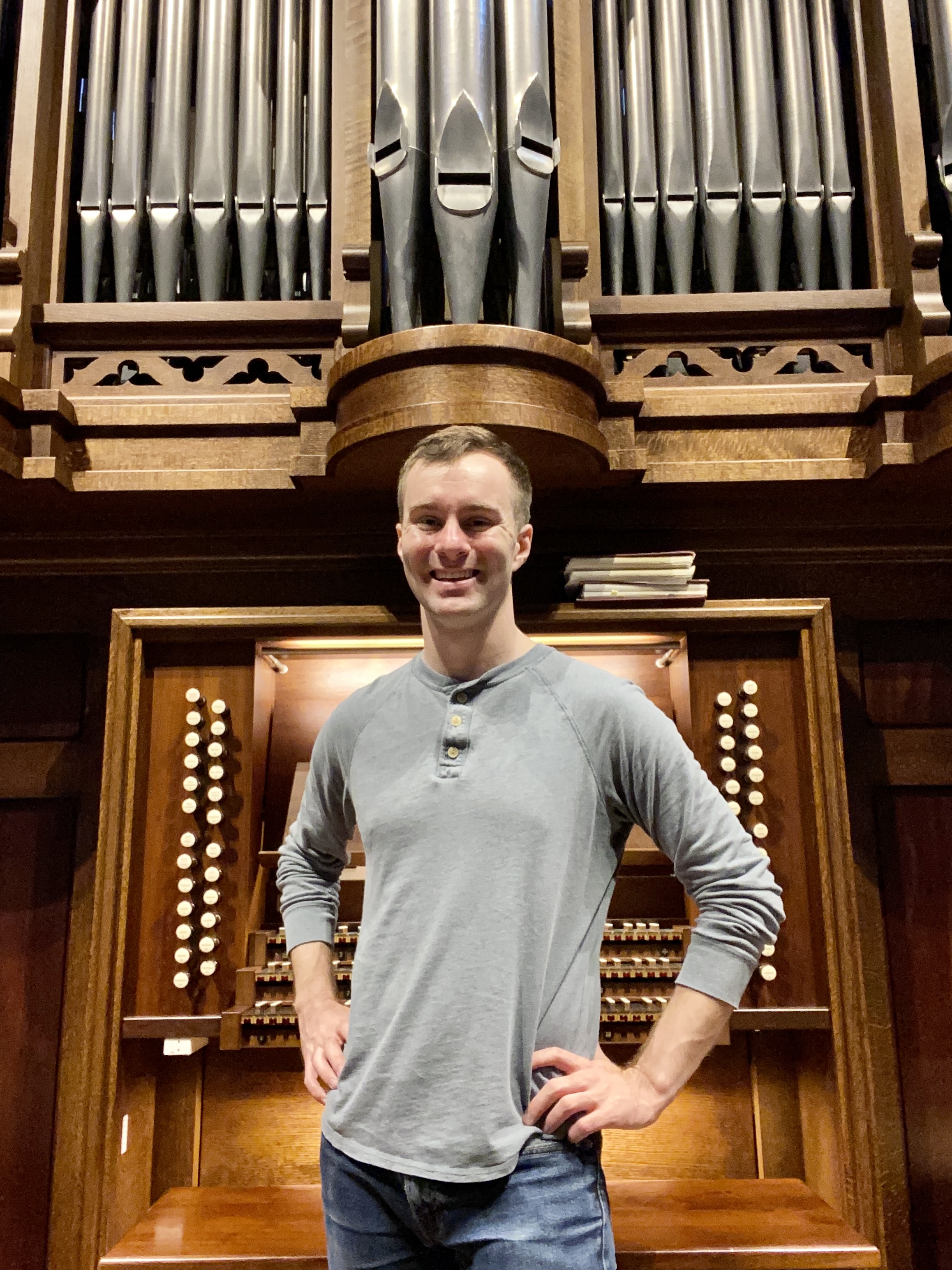
- A picture of your choir, your hall or a rehearsal beats anything bought. A phone photograph is fine; stock is not.
- Words
- One idea per slide. If a slide needs two paragraphs, it is really two slides.
- Looking designed
- Stay inside one group across a single post, then change group between posts. A post built from one layout looks like a template.
Season campaign
A band of colour above, dark below, your photograph crossing between them. Keep the layout, change the colour and the picture, and every post in a season still looks related.

the deadline
 Fugue Lab
Field split
Slide 1 / seriesCover. A band of colour, your photograph rising into it, and one mark where a face would be. Change the colour and the picture each time and a whole season still reads as one campaign.
Field quiet
Body slideA words-only slide that still belongs to the campaign. The heading crosses the colour break, so it holds attention without a photograph.
Formal and typographic
Closer to a concert poster than a social post. Corner lettering, centred capitals, and ruled tables for dates and venues.
Open
2027 Season
Corner frame
Slide 1Announcement. Letters pinned to the corners frame the slide instead of a logo sitting in one, which leaves the middle clear for what you are announcing.
the audition
cycle
Scattered plates
Body slideContents or overview. Small numbered pictures placed around a title, deliberately off the grid so it reads as arranged by hand.
Ruled schedule
Detail slideDates, times and venues. Dense information with no boxes or cards. This is the slide most festivals need and few have.
Mist field
Breath / closerA pause between louder slides. One line on soft light, for a thought that needs room around it.
Warm and hand assembled
Photographic, with notes and annotations stuck on top at an angle. The least corporate of the seven, and the closest to how people actually post.
Sticker cover
Slide 1Cover. A photograph, one big word, and notes stuck on at an angle. Warm and handmade rather than corporate.
Dashed quote card
Body slideA single strong statement on a card that looks cut out and placed. Good for the line you want quoted back to you.
Bracket heading
Body slideMarks either side of the word that carries the sentence. Emphasis without shouting, over a photograph.
Pill bullets
List slideThree or four short points as rounded rows. Stays readable over any picture, because every row carries its own background.
Quiet and spacious
Cream and mustard, generous space, small photographs carrying fine rules. Expensive looking without being loud.
Title and rule
Slide 1Opening slide, quiet and spacious. A title, a fine rule, and one small photograph carrying a number.
Mustard field
Body slideA block of colour to break a run of pale slides. One idea, set as a short paragraph.
Arch quote
Voice slideA line of praise or a quotation over an arched photograph. For words that came from someone else.
One continuous panel
Designed so a whole post reads as a single long panel as the reader swipes, with a fine line joining each slide to the next.
Seam panel
Body slide (panoramic)Part of a continuous run. The fine line down the edge joins each slide to the next, so a whole post reads as one long panel.
Swatch panel
Body slide (panoramic)Opens with a row of colours or categories, then the explanation. For anything that comes as a set.
Printed and orderly
Colour covers at each end, pale slides between, and a fine rule under every heading. For programmes, deadlines and anything with detail.
Field cover
Slide 1Cover. Your mark centred between two rules, the title low and in capitals. Formal, and it looks printed.
Plus body
Body slideTwo points on one slide, each with a heading and a short paragraph. The most words this set carries comfortably.
Column and plate
Body slideA heading across the top, then text beside a placed photograph. For explaining something with a picture alongside it.
Credits block
Body slideA photograph, a short explanation, and a small credit line beneath. The credits are what make it look considered.
Field closer
Final slideLast slide. A closing sentence and the icons that ask for a save or a share.
Soft and photographic
Arched picture crops with a mix of italic and upright type. Friendlier than the formal sets, and forgiving of an imperfect photograph.
Half field cover
Slide 1Cover. Colour on one side, photograph on the other. Works even when the picture is not your strongest.
- Video links that expire before review
- Repertoire lists pasted into a free text box
- Scholarship decisions tracked in a side spreadsheet
- Waitlist email sent to the wrong segment
Arch and list
Body slideAn arched photograph over a short list. Friendly, and readable at a glance.
Arch closer
Final slideLast slide. An arched photograph, a sign off, and where to find you.
Photograph first
The picture is the whole slide and the words sit on it. Needs a photograph strong enough to carry a frame on its own.
Fugue Lab
Cascade
Hook / slide 1Cover. Your words stepped down the slide, one to a line, straight onto the photograph. Bold, and hard to scroll past.

Understate
Breath / transitionOne short line, low on an undimmed photograph. Confident, and the cheapest way to look expensive.
Lower third
Body slideHeading and a supporting line along the bottom, like a documentary caption. Carries longer text without hiding the picture.
Numeral
Proof pointOne number at full height. Use it only for a figure you can name a source for.
 Fugue Lab
Refrain
Escalating list / whole carouselOne photograph carries every slide and the sentence restarts on each one, so only the last clause changes. Built for a list that gets worse as it goes. The repeated half sits back; the new half comes forward.
Cards on photographs
Something pale floats over the picture and holds the words. Keeps longer text readable without dimming the photograph.
Plate
Body slideA cream card set slightly askew on a photograph. Holds the most text of any of these and stays easy to read.
Notes
Aside / one linerA phone note over a photograph, so it reads as a caught thought. Effective once in a post, tiring if repeated.
Caption strip
Body slideA picture above, a caption band below, like a film still. The most legible of these in a crowded feed.
Paper
Light background with the photograph placed into it. The clearest break from a dark, glossy look.
Broadside
Hook / statementA large heading on paper with the photograph small at the foot. The furthest thing here from a stock template.
Spread
Body slidePhotograph on top, words below on paper. The reliable choice when your subject sits low in the frame.
Pull quote
Voice / testimonialA quotation set large, with the name beneath. For a sentence from a singer, a parent, or a review.