
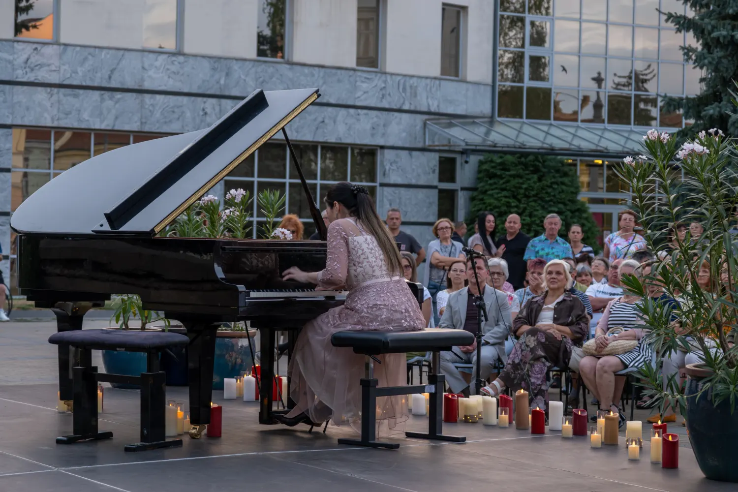
Vespers of 1610
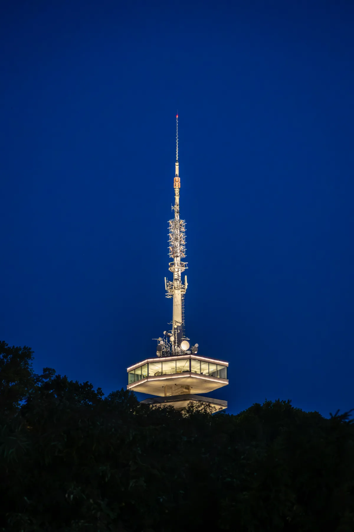
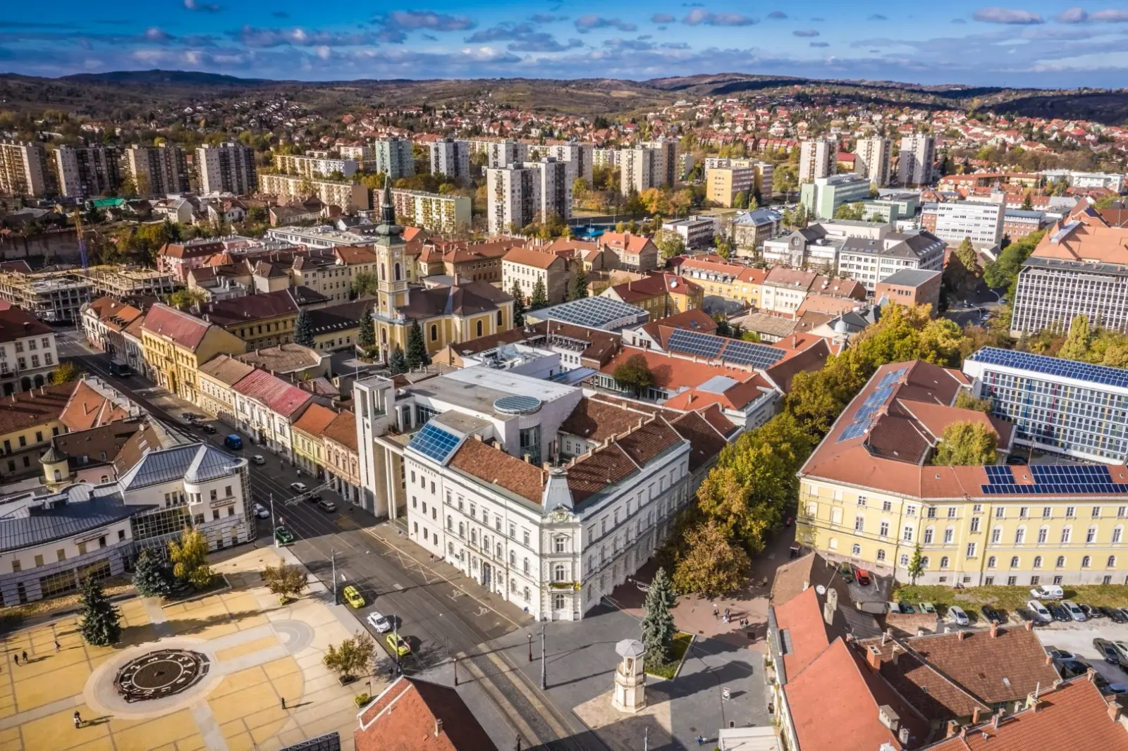
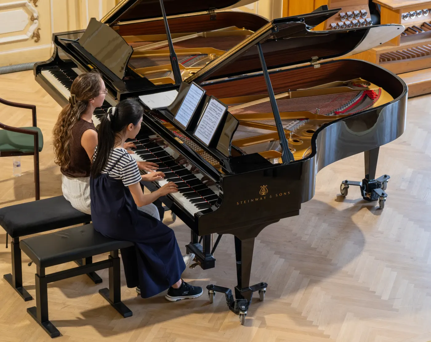
Concerts travel sideways as the visitor scrolls down. Shows eight or ten events in the space of one, and rewards scrolling rather than punishing it.
Vespers of 1610
St John Passion
The Late Quartets
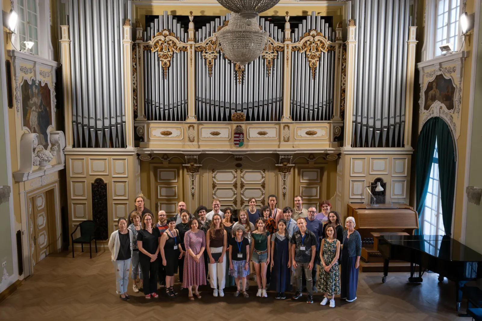
Partita for 8 Voices
Organ Vespers
Lessons & Carols
Continuo Lab
One heading holds its place while the answers scroll past it. Good for the page that has to explain something — a bursary, an audition process, why the festival exists.
Every fellowship covers tuition, room and board. No one has ever paid to come here.
Two coachings, one rehearsal and a masterclass slot a week, for three weeks.
Four public performances in the abbey, programmed by the fellows themselves.
Alumni book each other for years afterwards. That is most of what this is for.
The words arrive as solid blocks and resolve one at a time. Striking once at the top of a page; wearing if used on every heading.
Nineteen summers of music
A solid extruded side on the display type. Reads as cut stone or letterpress — suits an early-music festival better than a contemporary one.
Michaelmas
A field of faint stars with a slow comet crossing it. Sits behind a hero on a dark page; costs nothing and uses no images.
Pictures for the visitor who is browsing, a plain list for the one who already knows what they want. One programme, one toggle.
Vespers of 1610
St John Passion
The Late Quartets
Partita for 8 Voices
Organ Vespers
Lessons & Carols
A row of chips across the top of a season. The visitor who only sings choral music finds the three concerts that matter to them without reading the other nine.
7 events
Vespers of 1610ChoralSt John PassionChoralThe Late QuartetsChamberPartita for 8 VoicesChamberOrgan VespersRecitalLessons & CarolsChoralContinuo LabWorkshopA still that starts moving when the pointer rests on it. Where a rehearsal clip exists this sells a concert better than any photograph.
Opening nightVespers of 1610
St John Passion
The Late Quartets
Partita for 8 Voices
Photographs at three different sizes, packed. For the page that has to convey what a week here is actually like, where no single image does it.
Seven short lines, each one numbered. The most legible way to say what is included, and the hardest one to skim past.
An email address that copies itself when clicked. Better than a mail link, which opens nothing at all on a desktop with no mail app set up.
One line of heavy type set to the exact width of the column, resizing with the window instead of wrapping. The loudest thing a page can do with type alone.
A plain index of titles, with the photograph appearing only when the pointer reaches a row. The page stays instant for everyone and gets richer for anyone with a mouse.
Pictures at their own proportions, flowing into even columns with no gaps. Use when the photographs are the point and cropping them all to one shape would be a loss.
Search, filters that show their own counts, and a few at a time rather than all at once. For twenty years of past seasons, where a single long list is not something anyone reads.
Vespers of 1610ChoralSt John PassionChoralThe Late QuartetsChamberPartita for 8 VoicesChamberField and button as one control, with a line underneath saying what they are actually signing up for. The most valuable thing on most festival sites and usually the ugliest.
Each photograph uncovers from the top as it comes up the screen, and closes again if you scroll back. Tied to your scrolling rather than to a stopwatch, so it never plays to an empty room.
A quiet line and a loud line taking turns down the page. Says two things at once — what you do, and how you say it — without needing a subheading.
We spent
Nineteen summers
getting one room
to sound right
A short line in small caps sitting over the headline. Costs one line and tells a first-time visitor what kind of thing they are looking at before they read anything else.
Nineteenth season · Three weeks · Fully funded
A second row of navigation over the top of the filters, for a site holding genuinely different kinds of thing. Only earns its place when the categories would not sit sensibly in one row.
A small portrait and a name under each item, so a season reads as the work of people rather than a list of titles. One promoted slot, marked as such.
Fine rules and survey marks behind the page, with the panels deliberately overlapping off the grid. Suits a festival that wants to look like a workshop rather than a brochure, and it costs nothing because there is no image.
What we do
Who we do it with
Everyone who has played here, set in a strip that leans a degree or two off true. A cheap way to list forty names without it reading as a spreadsheet.
Musicians who have played here
Rachel Podger · Iestyn Davies · Nicola Benedetti · Mahan Esfahani · Carolyn Sampson · Jonathan Cohen · Elizabeth Kenny · Alina Ibragimova · Roderick Williams · Sophie Bevan
One sentence and one link, on an otherwise empty screen. What a page should end on when the alternative is a footer full of links nobody clicks.
Where a page needs to do more than sit still — an opening image, a season switcher, a programme card that turns over. Shown on a light background and a dark one, because they behave differently on each.
Seen something you like? Answer five short questions and we will show you your own site wearing it.
Design your site